How every shape and every colour was thought through
Zeøna is designed for your wellbeing and your rest. Every decision about shape and colour is inspired by ideas from colour psychology, perception and design. These notes explain those principles and why the whole works as a coherent unit.
6
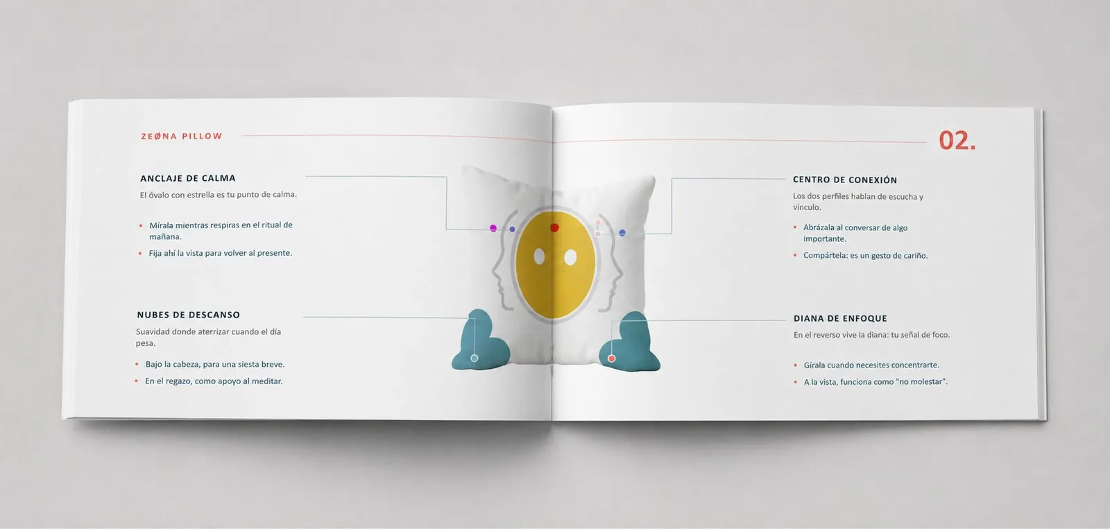
Functional zones
5
Sensory channels
2
Faces with a purpose
12
Guided rituals included
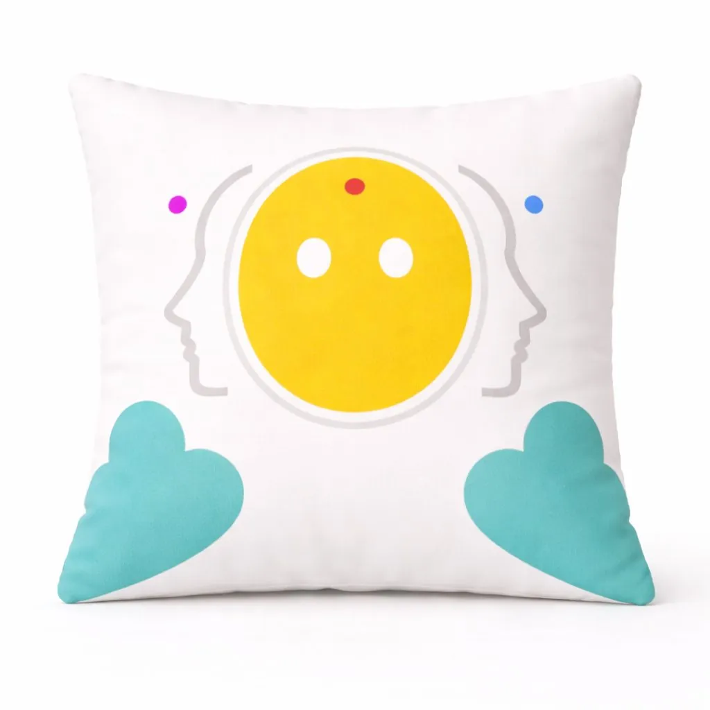
Made for intense days
Zeøna was born from one idea: taking care of you. We thought about the person who holds everyone else up and whom nobody holds, about the mind that will not switch off at the end of the day. And we wanted to create a companion that asked for nothing in return.
Every shape, texture and colour is chosen to accompany you, never to demand. The softness of the fabric, the comforting weight in your hands, the tones that evoke calm: everything invites you to let go.
Zeøna is a wellness and rest product, not a medical device.
Would you rather see the six zones on the pillow itself?
Explore the pillowNo colour is decorative
Warm tones accompany expression; calm tones, presence and holding. This colour geography guides you through the ritual with no need for instructions.
Yellow
Front oval. Expressiveness, warmth and visual attention.
Coral
Dot and target. Warm visual capture; it accompanies directed action.
Turquoise
Heart and brand. The calm of blue with the welcoming quality of green. The colour of Zeøna.
Violet
Imaginative dot. Openness, expressive warmth, play.
Aqua
Serene dot. Serene focus and a sense of stillness.
Pink
Back bands. Chromatic calm, low visual activation, holding.
When the senses add up to more than their parts
What makes Zeøna special is not any single element, but the integration of several channels in one companion: sight, touch, proprioception, posture and voice work together coherently.
- 👁 Visual — colours, coral dot, profiles: capture and focus of attention
- ✋ Tactile — turquoise heart, enveloping surface: slow touch
- 🎯 Proprioceptive — coral target, grip: completing the gesture
- 🫂 Postural — pink bands, hug: holding
- 🗣 Vocal — warm oval: contained vocal expression
Explanatory design, honest promises
These notes describe general principles of design and perception; applying them to the product does not imply any claim of clinical efficacy. Zeøna is a wellness and rest product, not a medical device.